Official College Logo
PCC has two primary logos for usage – the stacked logo and the horizontal logo. Either one of these must be used on all PCC-branded materials. Any old logos should not be used.
PCC’s primary logo is critical to the college’s visual identity and is the college’s official identifying mark. The logo is used for academic and administrative purposes and must be used in its specified dimensions.
It cannot be redrawn, reconfigured, modified, or altered in any way. It is not appropriate to stretch the logo to fit in a space, to add outlines or shadows to the image, to change colors or to remove any of the letters.
Logos are available to PCC employees via SharePoint: PCC Stacked Logo {opens in new tab} or PCC Horizontal Logo {opens in new tab}.
External use of the PCC logo requires approval from the Marketing and Communications department.
Secondary Logos
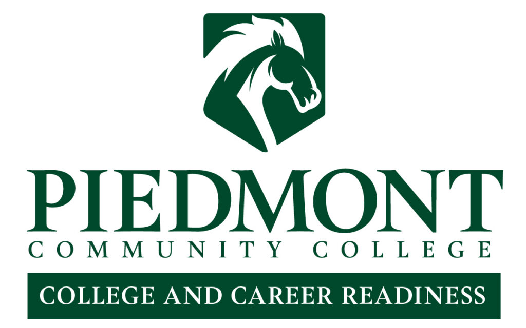
Secondary logos are a way of branding individual groups within the College. Any group within a department, division or program is eligible to receive a secondary logo.
All secondary logos must be created by the Marketing and Communications department. Secondary logos can replace the main PCC logo on printed material. It is not necessary to use both.
Tagline Specs and Usage
The tagline, “Your hometown college,” helps position PCC as a pleasant place to grow and reach your goals.
The following examples show how to display this tagline.
Formats Defined (EPS, JPG/JPEG, PNG, PDF)
Encapsulated Postscript File (EPS )
- An EPS file is a vector graphic
- This format may be requested by commercial printers, sign makers or embroidering companies.
- This file type is scalable without losing quality.
Joint Photographic Experts Group (JPG or JPEG)
- A high-resolution JPG is best for in-house printing; A low-resolution JPG can be used for electronic applications.
- It cannot be enlarged without losing image quality.
Portable Network Graphics (PNG)
- A PNG file is a bitmap graphic.
- It should be used when a transparent background is required.
- A high-resolution PNG is best for in-house printing.
- A low-resolution PNG can be used for electronic applications.
- It cannot be enlarged without losing image quality.
Portable Document Format (PDF)
- A vector PDF file is a versatile file that can be used for communication between sources and is easily viewable by most users.
- Note that when creating a document for PDF use, it is important to keep the original file (Word, Excel, etc.) to allow future edits. Edits to PDFs can be tricky.
- This file type is scalable without losing quality.
Brand Colors
The official colors of PCC are the green of the rolling piedmont fields and the orange of the sun. Green should appear on all communications that use color. Secondary colors allow for variations of official colors when more or less contrast is needed between a set of colors.
Primary Green
| Hex# | RGB | CMYK | PMS |
| 00492c | 0, 73, 44 | 90, 42, 89, 48 | 350 |
Primary Orange
| Hex# | RGB | CMYK | PMS |
| f58220 | 245, 130, 32 | 0, 60, 100, 0 | 138 |
Accent Colors
| Light Green | Hex# | RGB | CMYK | PMS |
| 008265 | 0, 130, 101 | 86, 27, 71, 10 | 7716 |
| Light Orange | Hex# | RGB | CMYK | PMS |
| ff941f | 255, 148, 31 | 0, 50, 96, 0 | 1375 |
| Orange | Hex# | RGB | CMYK | PMS |
| f26522 | 242, 101, 34 | 0, 75, 100, 0 | 166 |
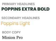
Brand Fonts
The PCC logo has been designed with a unique typeface. It has been customized for our brand to create an image that is specific to the College. To protect the integrity of the logo, use the following fonts for everyday communications (website content, print promotions, letters, signage, etc.).
Alternative Fonts
There are certain circumstances in which the recommended fonts are unavailable. In these cases, there are readily available, common fonts that may be used as alternatives. Use the following fonts if and when the recommended fonts are unavailable.
| Headlines | Body Copy |
| Montserrat (Google-Fonts-Free) | EB Garamond (Google-Fonts-Free) |
| Proxima Nova (Adobe Typekit) | Times Regular (Google-Fonts-Free) |
| Arial Bold | Lato |
| Gotham Bold | |
| Wilderness Typeface |
Typography
- Avoid condensing or stretching the typeface. Use the condensed or extended version within the font family.
- Use all uppercase sparingly, as it is difficult to read.
- Use script fonts sparingly. Never use a script font in all uppercase.
- Do not use double spaces between sentences. One space is standard.
Voice and Message
- Piedmont Community College should have a distinct, consistent voice. This is the tone, style and perspective used for all communications.
- The voice should be first-person plural. The tone should be pleasant and welcoming, but not overly casual. Example: “We thank you for visiting Piedmont Community College’s website. If you have any questions about our College, please do not hesitate to contact us.”
- In written communication, avoid excessive use of contractions and exclamation marks.
- In verbal communication, use language that would be appropriate and understandable for a prospective student. Avoid higher education jargon and acronyms.
Email Signature
Standardizing our email signature is one of the most efficient ways to professionally represent our brand. Please adhere to the following standards when setting up email signatures.
You may use piedmontcc.edu or a shortened URL (example: piedmontcc.edu/nursing or piedmontcc.edu/advising) Do not use a full URL like https://piedmontcc.edu/becoming-a-student/request-information/
Slogans, quotes and scripture are not permitted in email signature.
Your Name
Title

1715 College Drive, Roxboro, NC 27574
Phone: 336-322-6789 | Office: D100
piedmontcc.edu/news
We value your feedback! Please take a moment to complete our Satisfaction Survey.